Accuro 2014.09
Release Preliminary Screen Shots
Below are some screen shots to provide a contrast of some of the differences in the look and feel of Accuro between 2014.09 and earlier releases.
These screenshots are an early development version of 2014.09 which will evolve prior to release.
To see the current version, go to: Ontario 2014.09 Demo Accuro
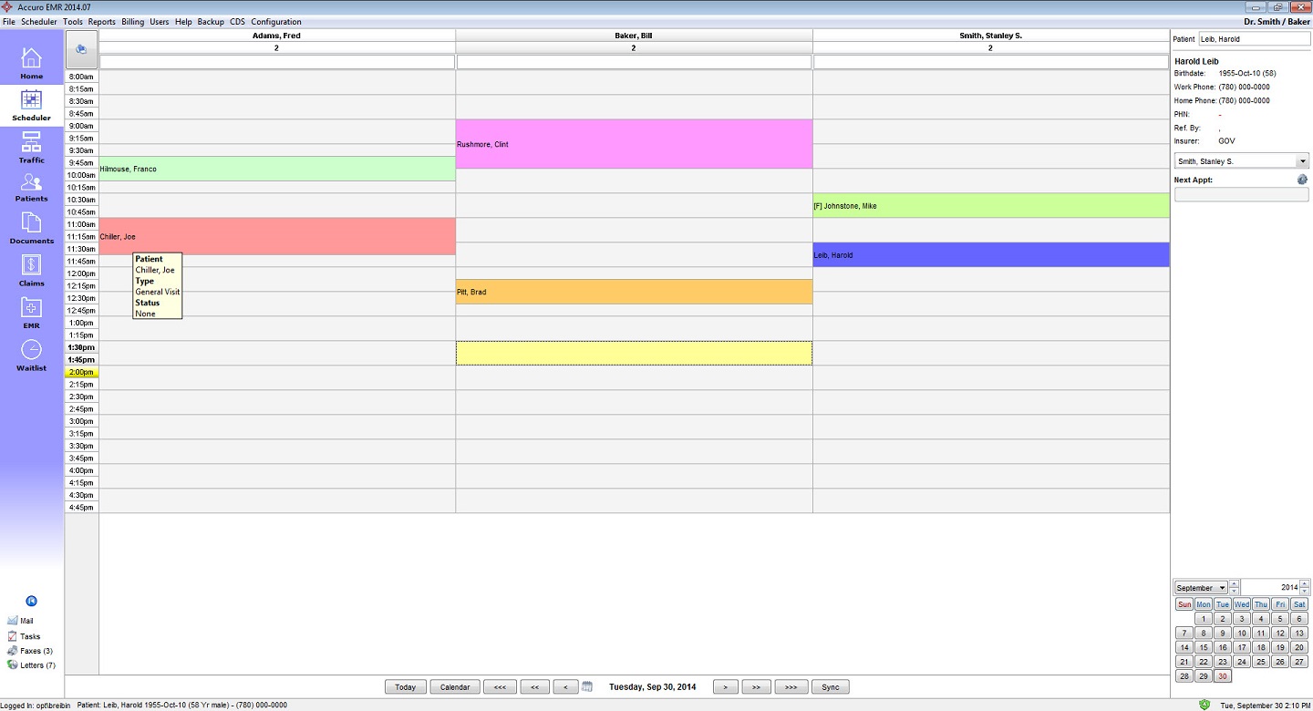
2014.07 Schedule


2014.09 Schedule
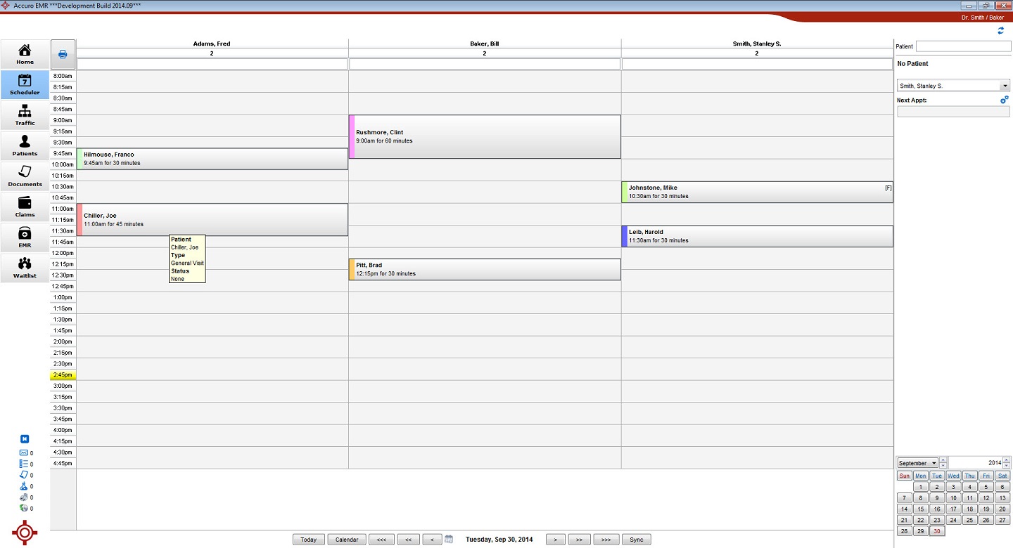
You will notice in
this screenshot the overall modernization
enhancements that come with 09. The top of the screen has been cleaned
up and stylized
with the new Swoosh. Within this stylized top bar the patients
information will
be displayed on the left hand side. Also on the left you can see the
modernized
Icons, however note that not all icons have been replaced at this time.
The active clinic still appears at the upper
right but now appears on the red background of the swoosh.
Appointments themselves now by default appear with the color indicating the type only on the left hand side for a much more modern look that allows the details of the appointment to show clearly. Also note the addition of additional appointment details to the display.
2014.07 EMR
2014.09 EMR
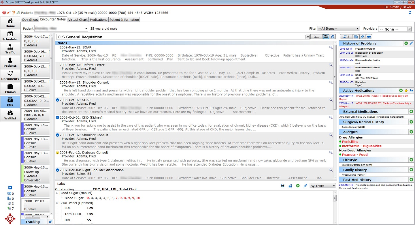
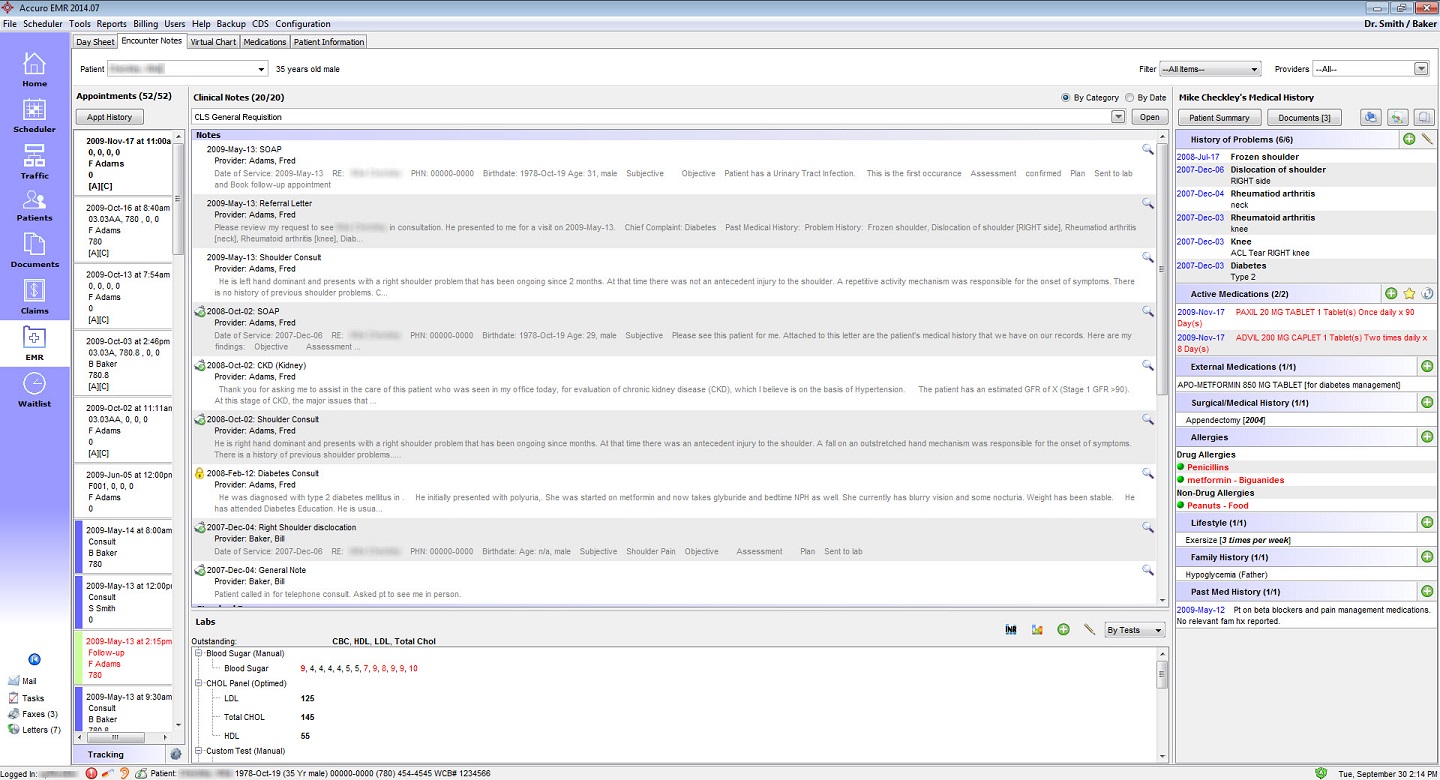
A simple screenshot to illustrate how the EMR section will look. Notice that the counts have been removed from the medical history bands. You may also notice the use of a new color scheme for icons, green is generally used or safe actions like adding an entry. Blue will be used for configuration, edit, and change type actions. Red icons are used for actions that require careful considerations, like to remove.
2014.09
Menu
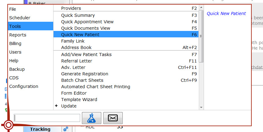
In the lower left
corner you will notice that there is a
small Accuro icon. Clicking on this icon will display the new menu;
this
replaces all the options that previously resided in the menu bar across
the
top. Users can dynamically make their selection by hovering over the
option on
the left then tracing the mouse over to the second column to make their
sub
menu choice. Additionally if preferred
the menu on the far left can be clicked to lock in the selection, which
can
make it easier for users to make their submenu selection. In the far
right column
a description of the item displays.
There is now a search
field as well, that allows the user
quick access to any of the options! The user can begin typing keywords
for
option they desire and as the results narrow make the selection with
the mouse,
or hit enter to use the keyboard to navigate the list. If the escape
key is hit
during this process the curser returns to the search field. When
searching, if
there is only a single result, hitting enter will launch it.
To the right of the search there are a number of icons each of these acts as a quick link to an action. More will be added in the future.
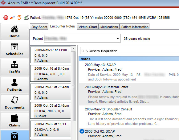
2014.09 Default Font Size
2014.09 Configurable Larger Font
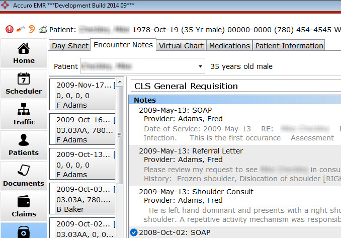
2014.09 will allow the
users configurability over the global
font size and style for the majority of Accuro.
Font can be configured
to be Verdana, MS Sans Serif, Times
New Roman, Tahoma, Arial, or Calibri in sizes 10 through 14.